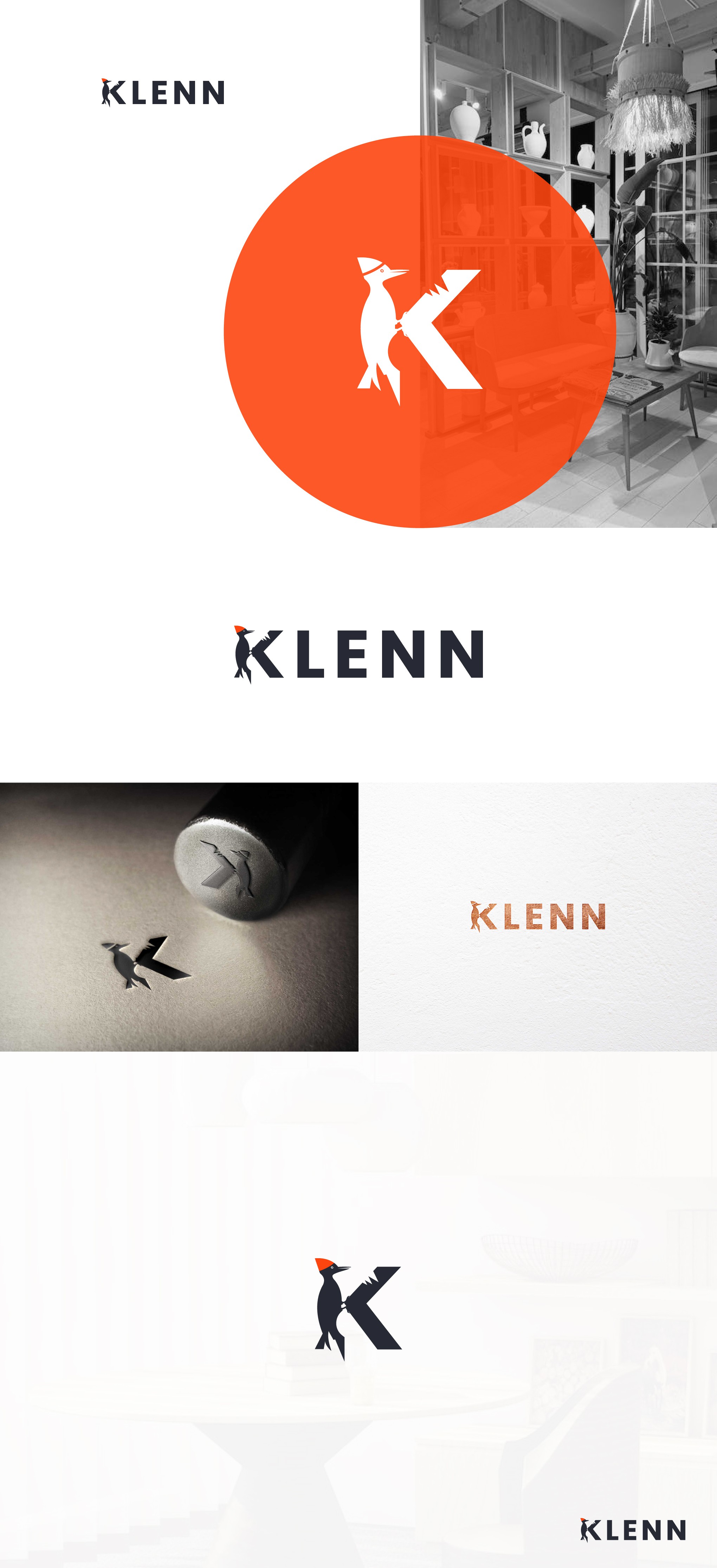

Klenn is a fresh face in the woodworking business. They make all sorts of wooden goods. The twist is, that they didn't want the logo to show trees or tools like everyone else does. They wanted something different, something smart.
So, I came up with a clever idea. I used a woodpecker and turned the letter "K" into it. You know, woodpeckers are real hard workers, always pecking away. In the logo, this woodpecker is pecking at the "K". It's like how the woodpecker builds its home through sheer effort. Just like that, Klenn builds top-notch stuff by putting in the hard work.
It's a simple picture, but it says a lot. The pecking woodpecker and the "K" shape together show how Klenn is dedicated to making great products. It's a symbol of their commitment and the care they put into everything they do.