Logo concept for film company

0
Kreiert mit 99designs von Vista
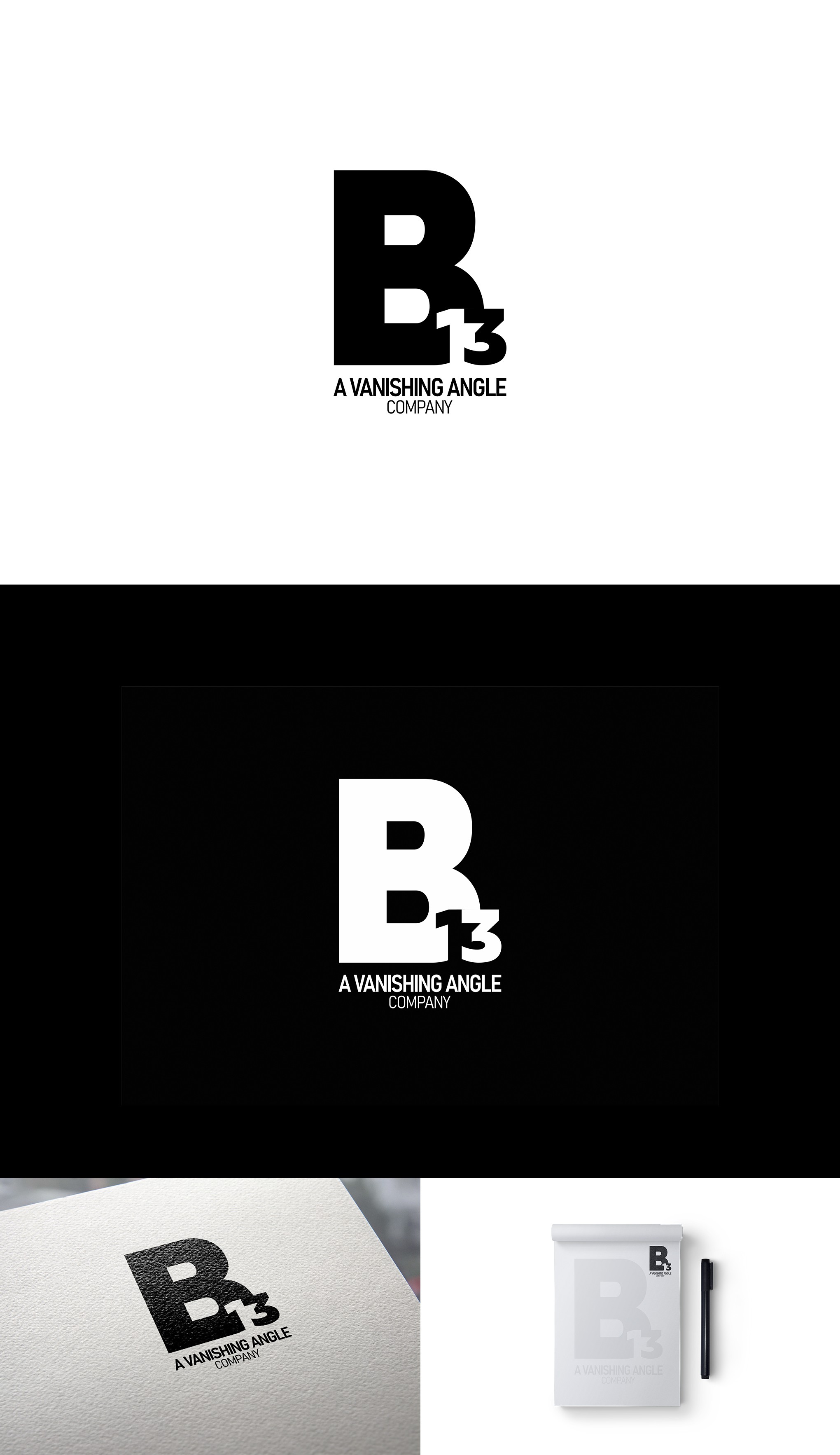
The principal idea was to present the name of the company in a strong way. We used a typography with simple and modern lines, with a big visual weight. This design is centered on a vertical axis and makes a block. The use of negative space to form the number 1 is a very pleasing resource to look at.
For the slogan, two variants of a sans-serif typography are used. It's elegant and modern.