Infographic with an creative illustrative approach

1
Kreiert mit 99designs von Vista
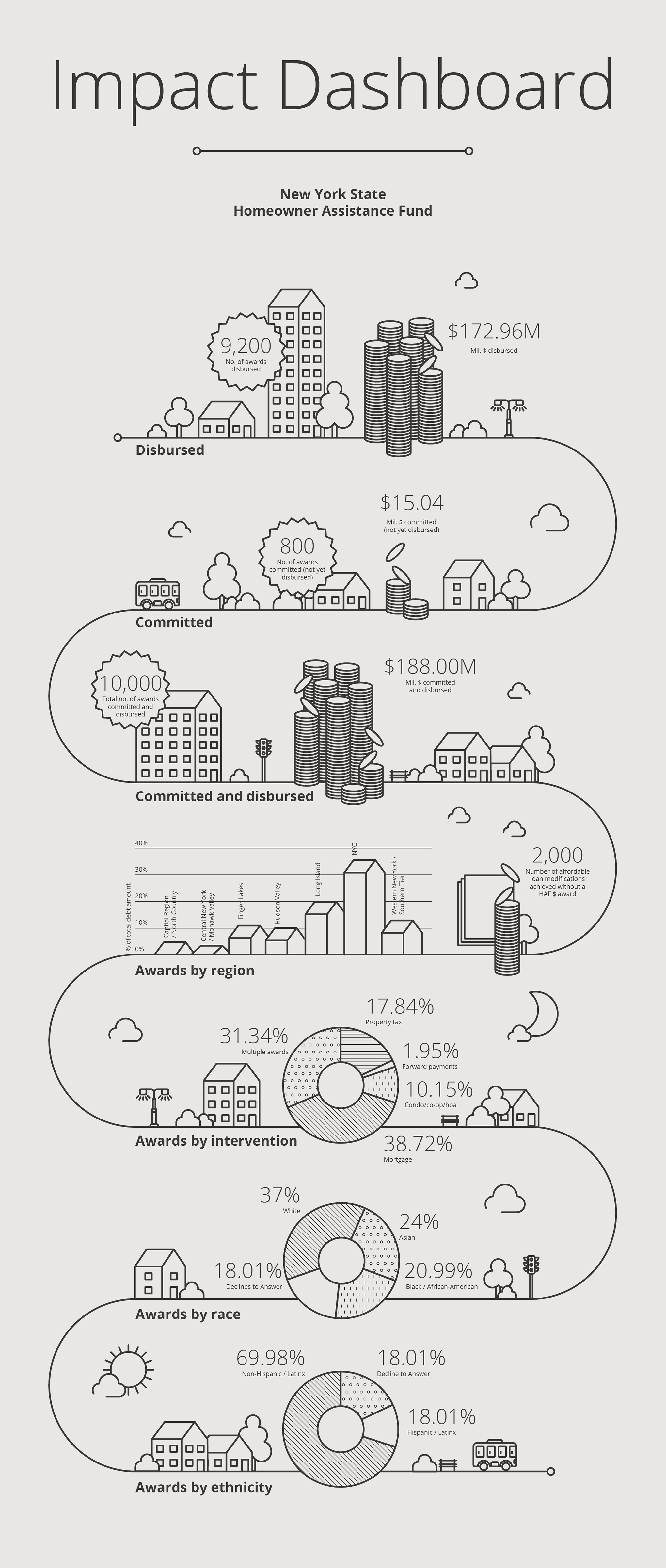
This infographic was built for an organization that helps COVID-19 economically affected families improve their homes or manage their housing debt. Illustration aimed to take a step back from displaying cold data, and to give it more personal approach. I believe that infographics and data visualizations are wonderful vessels to communicate much more than data, and still to get your points across with much clarity.