Informationen über Ihr Unternehmen
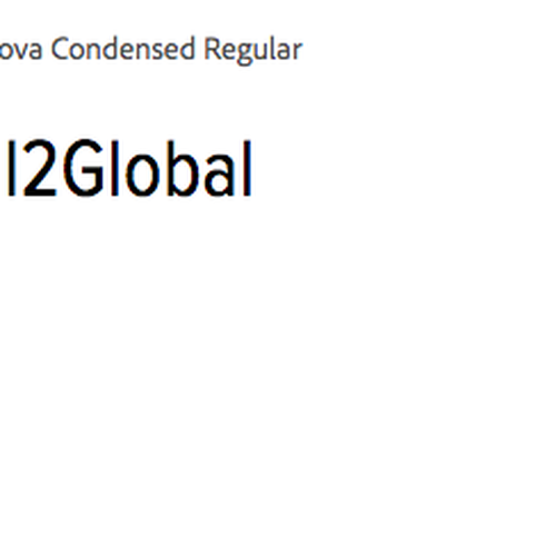
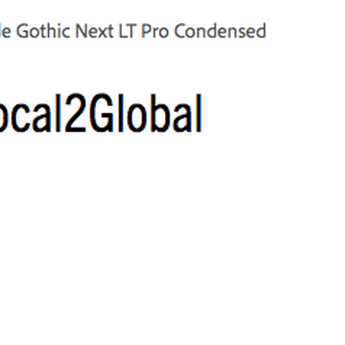
Name, der in das Logo integriert werden soll
Local2Global
Slogan, der in das Logo integriert werden soll
Beschreibung der Organisation und Ihrer Zielgruppe
A startup faith-based nonprofit organization that connects local people to global humanitarian projects all around the world (mostly in Asia). The brand style is professional, inspirational and motivational and seeks to convey a sense of movement, urgency, and compassion.
Branche
Gemeinschaft & Non-Profit


Referenzen
Anhänge
Weitere Anmerkungen
We're looking for an abstract minimal style 1 or 2 color logo. We don't want something too cartoon-like. We are looking for something that is modern and trendy but simple with clean lines.
Some ideas we have had include the following below, but we are open to new creative ideas that imply a local to global partnership connection or that give a sense of movement and connection from local to global.
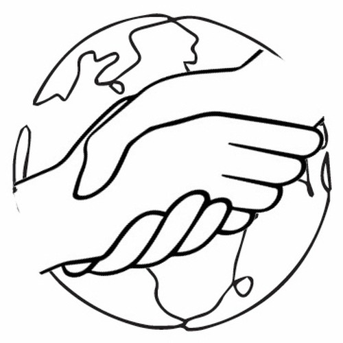
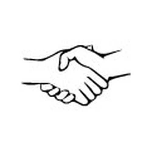
Hands & A Globe or Hands that are the Globe?
We like the idea of having two hands (both adult and both equal in size and in line/level with each other - not at an angle - to give the idea of a partnership. Use a traditional handshake or a "brotherly handshake"). We'd like to somehow combine that with a globe or abstract mark that makes you think of a globe.
We have been leaning toward Sans Serif fonts that are a little taller and condensed. We do not want a font that is too rounded or youthful looking.
Wettbewerb Deliverables
1 x Logo
Finale Dateien
Wenn Sie Schriften verwenden, die eine Lizenz erfordern, klären Sie zunächst mit dem Kunden, ob er damit einverstanden ist. Aus Lizenzgründen ist es besser dem Kunden die Informationen zur Schriftart mitzuteilen und wie man diese kaufen kann, ohne dabei die eigentlichen Dateien zur Verfügung zu stellen.
Jeglicher Text in einem Logo sollte als Outline konvertiert werden.
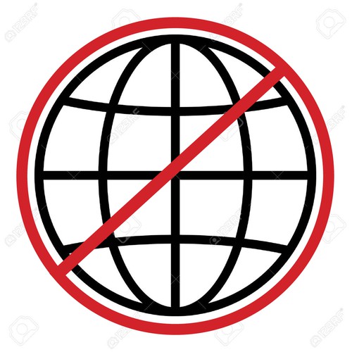
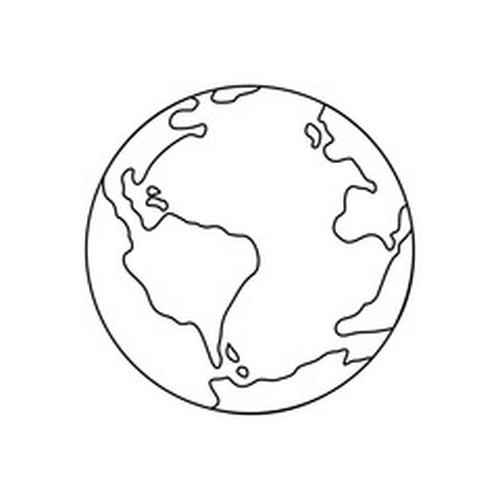
We like this graphic of a globe. It's simple and clear without looking too plain or sterile. It looks professional but approachable. It is not too youthful or messy.