Informationen über Ihr Unternehmen
Name, der in das Logo integriert werden soll
Part C
Slogan, der in das Logo integriert werden soll
Beschreibung der Organisation und Ihrer Zielgruppe
We are a national Medicare brokerage firm (insurance). Medicare is TYPICALLY for 65 year olds and up.
Branche
Medizin & Pharmazie


Referenzen
Anhänge
Weitere Anmerkungen
The colors on the site are blues and yellows. It's very modern and sleek looking site. I envisioned the logo to simply say Part C, possibly with the C to be inside of a pill, or incorporate some sort of pill or capsule in the design. I'm open to an actual logo, but felt for the company name and demographic having Part C with something healthcare related next to it or around it would make sense. I am looking for easy to read and modern, but again the target audience is 65 and up, so keep that in mind!
Wettbewerb Deliverables
1 x Logo
Finale Dateien
Wenn Sie Schriften verwenden, die eine Lizenz erfordern, klären Sie zunächst mit dem Kunden, ob er damit einverstanden ist. Aus Lizenzgründen ist es besser dem Kunden die Informationen zur Schriftart mitzuteilen und wie man diese kaufen kann, ohne dabei die eigentlichen Dateien zur Verfügung zu stellen.
Jeglicher Text in einem Logo sollte als Outline konvertiert werden.
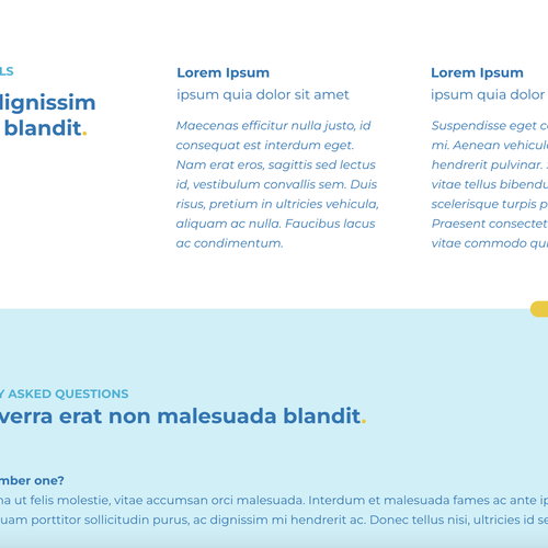
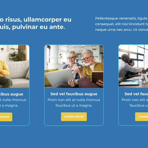
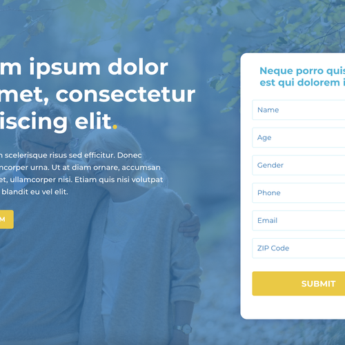
Obviously the copy write isn't in yet, but these are screenshots of the site.