Informationen über Ihr Unternehmen
Name, der in das Logo integriert werden soll
Bricks (or BRICKS, you decide)
Slogan, der in das Logo integriert werden soll
Beschreibung der Organisation und Ihrer Zielgruppe
Bricks is a shared workspace for ambitious entrepreneurs and startups based in Copenhagen Startup Village.
We believe that marketing and a mindful approach to business are two essential drivers of success.
As a community, we work to increase our profits, steadily strive to dominate our niches and build our startups to be highly market oriented. We achieve this on advanced and continual workshops focused on Direct Response Marketing. The workshops are tailored to fit entrepreneurs, and our members join them as part of their membership.
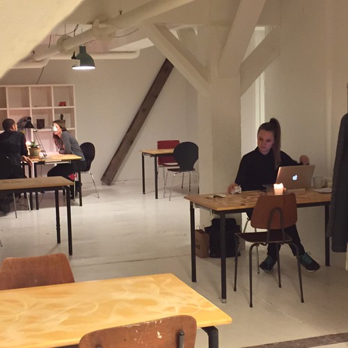
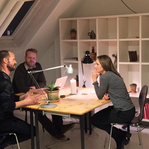
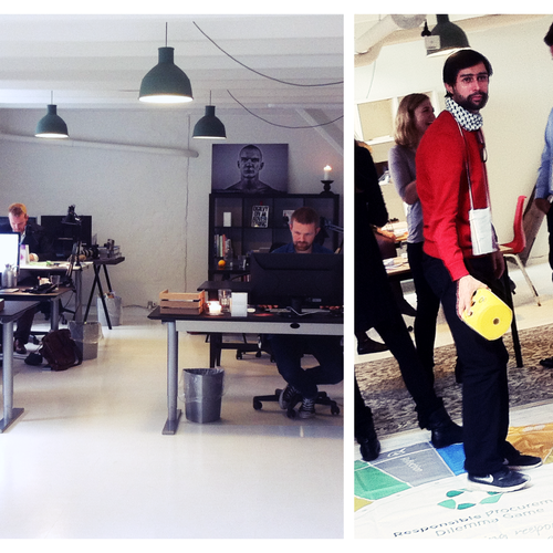
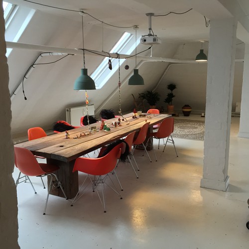
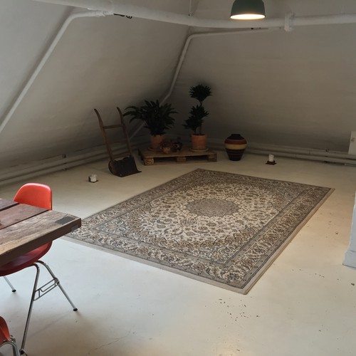
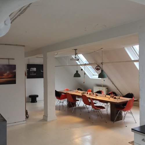
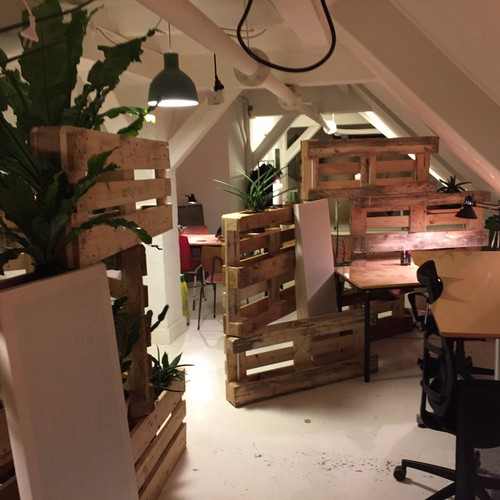
Our open office workspace is located in an old charming warehouse in Copenhagen. Our culture is inspired by mindfulness principles to enhance the work life of our members.
Branche
Gemeinschaft & Non-Profit
Wie soll Ihr Design aussehen?
Logo Typen
Zu verwendendes Logo
Bevorzugte Farben
We like the original theories of visibility, so we like the letters to be Dark (black e.g.) and the background to be white for example. We also like green (green don't necessarily have to be incorporated, though)
Weitere Farbanforderungen
Stileigenschaften
Designs zur Inspiration
Referenzen
Weitere Anmerkungen
Hello!
We're very excited to see how a bunch of talented people will play with our name and identity and come up with a great logo.
First off, we ran this contest once before, in the cheaper 299 dollar bracket, and got a lot of designs with actual bricks. We don't like that. An abstract version of bricks could be fine, though.
Also, last round did not feature very creative designs. Although we want the logo to communicate Simplicity as a Value, the logo shouldn't be TOO simple. Abstraction is welcome!
::: NEW DOCUMENT TO INSPIRE YOU :::
To be inspired, you can check out a new Draft Document were gonna use in our marketing:
http://goo.gl/tfj3B6.
We like the "Avenir" font, and we think BRICKS look quite good in capital letters (but doesn’t have to be capital or Avenir, though).
::: SPARK YOUR CREATIVE JUICES :::
Before we tell you more about our company, we would like to encourage you to bring out the best of your creative juices, and guide you towards certain ASSOCIATIONS:
+ Shared Workspace +
+ Community/Home +
+ Building upon each other together/social synergy +
+ Playfulness regarding the word "Bricks" could be incorporated +
And perhaps these associations, if you see it fit:
+ Entrepreneurship/Startups +
+ Marketing/Communication +
+ Mindfulness +
If this seems like an impossible task for you, then it's better to keep it simple.
The logo doesn't have to contain actual bricks. Only include if it makes sense as a whole.
It would be nice if we could use elements of the logo in different ways on meeting rooms etc. (for example different stacks of bricks/abstract bricks for different meeting rooms). It's not paramount, though.
Thanks!
-----------------------------------------------------------------------------------------------------------------------------------
::: MORE INFORMATION ABOUT US :::
Our names are Martin and Tony - two guys from Copenhagen, Denmark. Tony quit his job in june this year, and we opened up our shared workspace on the 1st of August, with our own money.
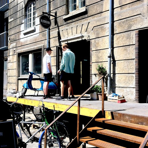
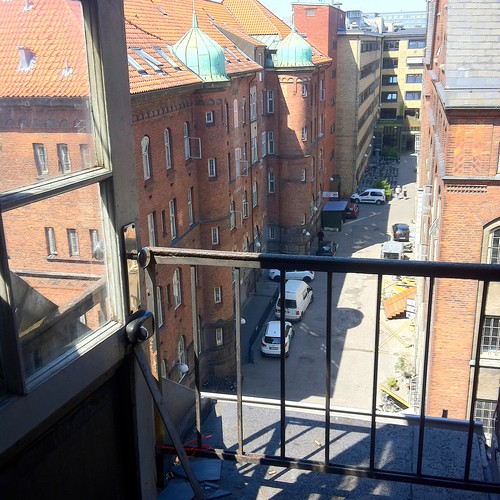
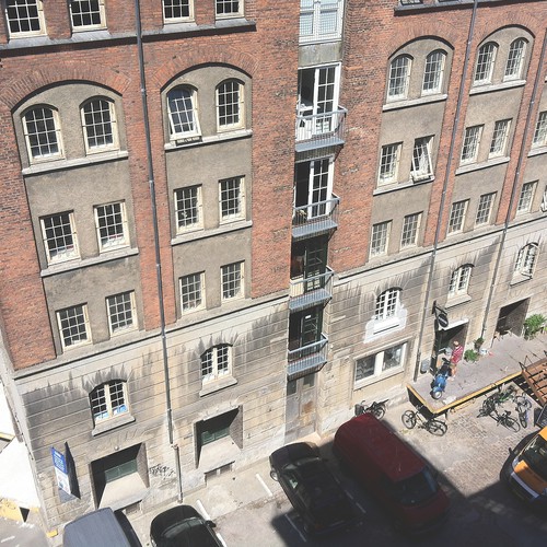
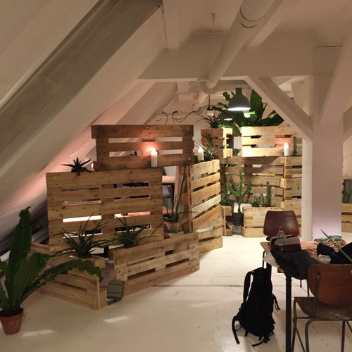
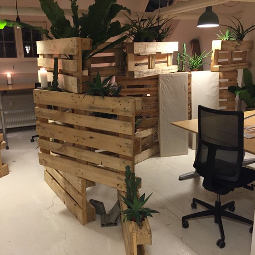
Our offices are based in the so-called Startup Village area in Copenhagen, which have become the largest tech-startup hub in Europe in a period of 6 months!
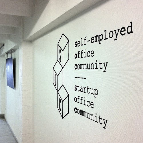
We started our own office community in this area with 2 members and are now 14. The area is 13.600 square meters of converted 100 year old warehouses - heating pipes through the rooms, everything build out of bricks etc. We have been working hard with direct sales and networking and have established a great community of ambitious and sympathetic people. Our current name is soc. (pronounced as the first part of the word social), and our current website is soccph.dk and facebook is facebook.com/soc.is.social. Go check out the pictures, our Sales Letter on our webpage (click on the image), prices and more. We have spent about a month, and many hours of coming up with a new name, and now we finally found one we're excited about. We think the name sends warm signals of "home" and "building stuff" perhaps "building stuff together" and the raw feeling of a warehouse built of bricks - all great to describe our shared workspace.
We're planning a total relaunch of our visual identity, new website, change of name and identity on Facebook, e-mail signatures and so on this January, 2015.
We can't wait!
Best regards,
Martin and Tony
Wettbewerb Deliverables
Logo
Finale Dateien
Wenn Sie Schriften verwenden, die eine Lizenz erfordern, klären Sie zunächst mit dem Kunden, ob er damit einverstanden ist. Aus Lizenzgründen ist es besser dem Kunden die Informationen zur Schriftart mitzuteilen und wie man diese kaufen kann, ohne dabei die eigentlichen Dateien zur Verfügung zu stellen.
Jeglicher Text in einem Logo sollte als Outline konvertiert werden.