Informationen über Ihr Unternehmen
Name, der in das Logo integriert werden soll
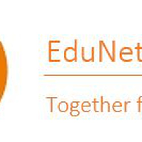
EduNet Europe
Slogan, der in das Logo integriert werden soll
Together for Education
Beschreibung der Organisation und Ihrer Zielgruppe
EduNet Europe is a non-profit Edu(cation) Net(work).
Slogan:
Together for Education | inspiring - innovative - interdisciplinary
Vision:
Equality of educational opportunity
Missions:
Cooperation projects
Professional Development Courses for Educators
Our logo should be MINIMALIST in design (and, if possible, dynamic).
Our logo should be based on the idea of a NETWORK (and maybe themes around international / European / education).
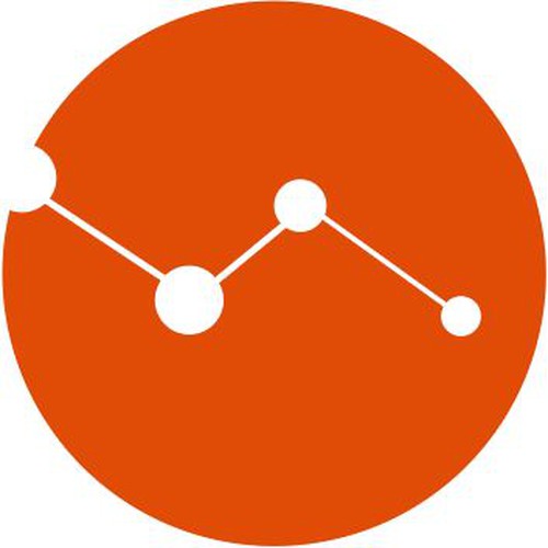
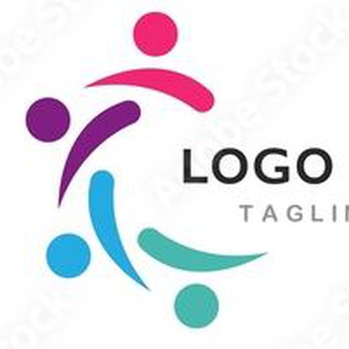
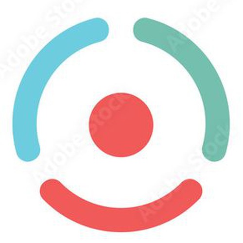
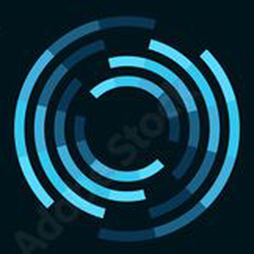
The design examples we picked show several different ways of elements (ellipses, dots, shapes) coming together to form a network.
Ideally, the logo would have a stand-alone shape but could also be used with a background circle for seals.
Try to make the logo look interesting and unique by creating negative space. Try to use overlapping shapes and creatively cut off overlapping parts to reduce the logo to a minimalist form.
Try to aim for no more than 3 or 4 elements in the logo.
The challenge is to express the idea of a network (of people) without being too generic. Can you find a way to use abstract forms that just hint at the idea of people (without using generic V-shaped etc. people)?
The logo must be scalable and work:
— on our webpage, business card, letter head
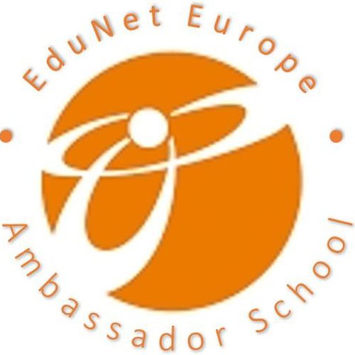
— as a plaquette on school and university homepages to display that they are EduNet Europe Ambassador Institutions
— as a "seal of quality" on academy certificates
— as an app icon
— (as favicon)
Please note:
We will try to give verbal feedback instead of handing out stars.
Branche
Bildung


Referenzen


Weitere Anmerkungen
PLEASE NOTE:
— 1st round:
ONLY BLACK & WHITE CONCEPTS
-> Please present the logo on a simple white or black background in a frontal view (no pictures, no fancy signs, etc.).
-> The logo should work both on a light and dark background.
— 2nd round:
We will talk about colours, font types and where to place the company name and slogan.
!!! Please NO GENERIC SYMBOLS, such as
— graduation caps / hats
— books
— hands
— abstract people (v-shaped, in a circle, etc.)
— lamps / bulbs
— pens
— flowers, plants, animals
— 3D-cubes with initials
— European stars
— generic ee-logos from Google Pictures search
Wettbewerb Deliverables
1 x Logo
Finale Dateien
Wenn Sie Schriften verwenden, die eine Lizenz erfordern, klären Sie zunächst mit dem Kunden, ob er damit einverstanden ist. Aus Lizenzgründen ist es besser dem Kunden die Informationen zur Schriftart mitzuteilen und wie man diese kaufen kann, ohne dabei die eigentlichen Dateien zur Verfügung zu stellen.
Jeglicher Text in einem Logo sollte als Outline konvertiert werden.
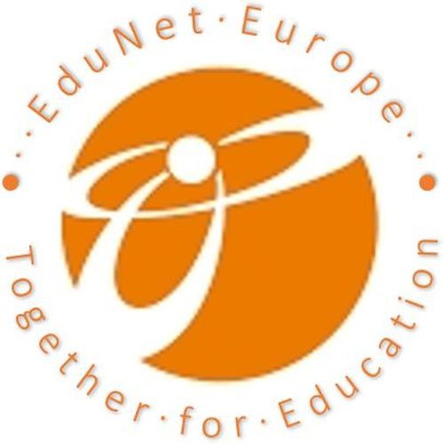
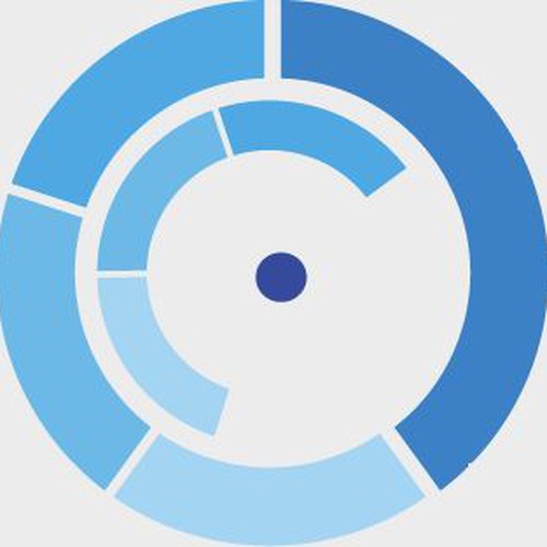
This is an existing logo we found on the internet. We used the mirror-image and added our company name. We like the dynamics and that the ellipses symbolise both "network" and "impact".