Informationen über Ihr Unternehmen
Name, der in das Logo integriert werden soll
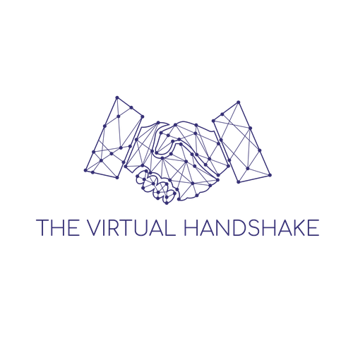
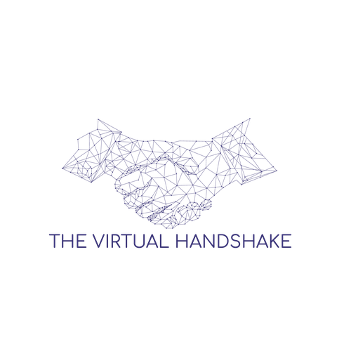
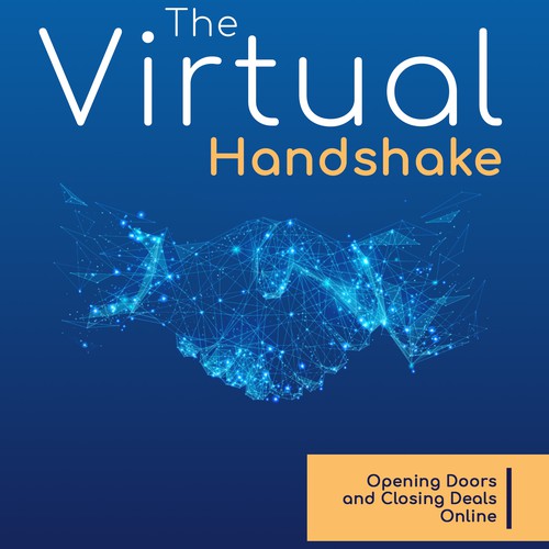
The Virtual Handshake
Slogan, der in das Logo integriert werden soll
We do social at scale. OR Social at scale. OR none (we're open)
Beschreibung der Organisation und Ihrer Zielgruppe
We are a consulting firm helping mid-market and growth-stage companies deal with the technical, operational, and organizational challenges of large social media operations.
We also provide role-based training courses in individual social media strategy, e.g., Social Selling, Relationship Marketing, etc.
Our target customer is either the head of social media, their boss (marketing executive), or the IT manager/executive who supports them.
Branche
Wirtschaft & Beratung
Wie soll Ihr Design aussehen?
Farben zum Entdecken
Weitere Farbanforderungen
Primary color should be blue to blue-violet, in the range from:
RGB(0,100,170) to RGB(0,28,80) (blue range), leaning towards:
RGB(52.46.114) - this is our current color, but we're willing to change it
Secondary color would ideally be RGB(251,189,102) - this is our current color. We're also willing to change it, but not too radically different.
Third color, if needed, is at designer's discretion.
Stileigenschaften

Referenzen
Weitere Anmerkungen
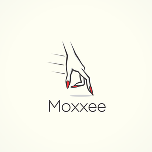
The key concepts are the handshake and the digital network. We had a graphic designer do some concepts, but we weren't happy with the end result (hands are awkward, the network concept as executed doesn't scale down well, etc.). The logo needs to work at both large and small scale.
The 1st edition of our book came out in 2015. The cover art from it is very dated. We have a concept for a new 2020 2nd edition that we like. The logo should go well with the new cover concept. We love the hands on the cover, and that's the concept we're going for, but we're having a hard time scaling that concept down to a logo.
We are open to other ideas, not just scaling that down -- we just need to get those key concepts across.
I have also attached three concepts from our designer that we weren't satisfied with.
#1 - Pretty much a straight scale-down from the cover design. It's too complex.
#2 - A simplified version - it's clunky.
#3 - A completely different direction - the "digital" aspect is more suggestive of a circuit board than a network.
Also, the hands should look gender-neutral and not have cuffs or other ornamentation.
We very much like the Comfortaa font. We do have a slight preference for it in all lower case rather than caps. We're open to other fonts, but it should be simple, modern, and preferably a Google font so that it can be used as a header font on the website.
Wettbewerb Deliverables
Logo
Finale Dateien
Wenn Sie Schriften verwenden, die eine Lizenz erfordern, klären Sie zunächst mit dem Kunden, ob er damit einverstanden ist. Aus Lizenzgründen ist es besser dem Kunden die Informationen zur Schriftart mitzuteilen und wie man diese kaufen kann, ohne dabei die eigentlichen Dateien zur Verfügung zu stellen.
Jeglicher Text in einem Logo sollte als Outline konvertiert werden.