Informationen über Ihr Unternehmen
Name, der in das Logo integriert werden soll
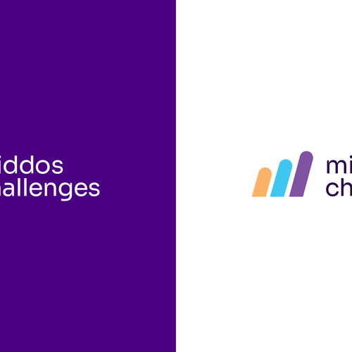
Middos Challenges
Slogan, der in das Logo integriert werden soll
Turning inspiration into action
Beschreibung der Organisation und Ihrer Zielgruppe
We send out (via email and Whatsapp) tips and insights into how to work on developing good character traits, such as patience, humility, and gratitude.
In addition to inspirational content, we offer quick, practical challenges that people can do every day to gradually improve their character one bit every day, and become the best person they always wanted to be.
Branche
Bildung


Referenzen
Weitere Anmerkungen
I have a logo already (see file attached) but I think it looks a little childish because of the colors and the simple round shapes. So I would like something that looks more mature. This is a program for adults, not kids.
That said, I do want the logo to have a sense of ENERGY because I want to give the sense that I am EMPOWERING people to become the best version of themselves.
In the current logo, the icon is supposed to be an M, and it represents growth (going higher in 3 steps) and movement (because it's slanted). I like these concepts but I wish there was a way to do it in a way that looks a little more mature and less childish. I think what's making it look childish is that the icon is such a simple, plain shape.
I think the bright blue in this logo looks a little childish but I'm not sure what other color to use instead. I do like purples and orange but again, I don't want it to look too childish. And I want the colors to have a sense of harmony and matching with each other. See my website https://middoschallenges.com/ - You will see how it is purple and orange. I like the purple and orange but I'm open to other suggestions as well!
This program is for both men and women so I do not want it to look too feminine
Also, I feel like this logo looks a bit too modern and I want it to look just a drop more traditional. Some of my audience is not "cool" so they will not relate to something that looks way too cool. But it should not look too old and traditional because I am developing an app, so my logo will have to look good as an app logo. Maybe try a font for "Middos Challenges" that has slight serifs? Not sure. Like I said, I do want this to look good as a logo for an app as well as a book...
In summary, I would like to tweak this logo (or come up with something else that:
- looks like a program for adults, not kids
- would look good as an app logo
- would also look good if used on a book (I am working on publishing a book)
- has a sense of energy, empowerment, or inspiration
- ideally it would be nice if the logo shape hinted to an M or MC
- Maybe an abstract shape is better than a literal shape (for example: I think an icon of a plant growing will look way too cheesy)
I need to see how the logo will look on both dark and light backgrounds (as you see here in my current logo file)
Thank you!
Wettbewerb Deliverables
1 x Logo
Finale Dateien
Wenn Sie Schriften verwenden, die eine Lizenz erfordern, klären Sie zunächst mit dem Kunden, ob er damit einverstanden ist. Aus Lizenzgründen ist es besser dem Kunden die Informationen zur Schriftart mitzuteilen und wie man diese kaufen kann, ohne dabei die eigentlichen Dateien zur Verfügung zu stellen.
Jeglicher Text in einem Logo sollte als Outline konvertiert werden.