Wie soll Ihr Design aussehen?
Verpackungstyp
Paket
Farben zum Entdecken

Weitere Farbanforderungen
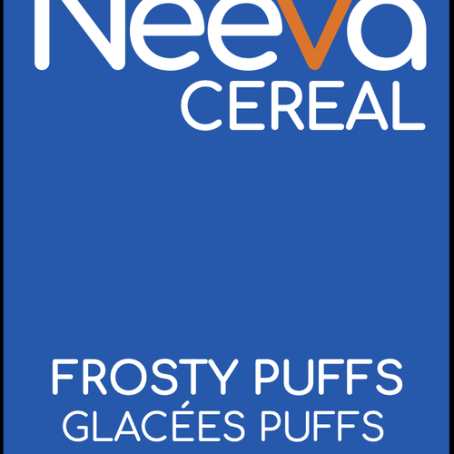
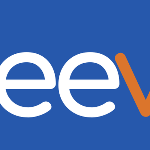
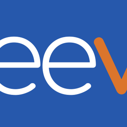
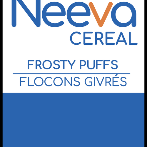
I like the idea of pulling the colours from the original cereal boxes to give people the child like feeling. Right now we are starting with Frosted Flakes, which means Blue (HEX: #0065b5), Orange (HEX: #ef7b2f) and White.
Unternehmen
Branche
Essen & Trinken
Firmenname
Neeva
Bestehende Website
Produkt
Produktname
Neeva Cereal (Frosty Flakes)
Beschreibung des Produkts
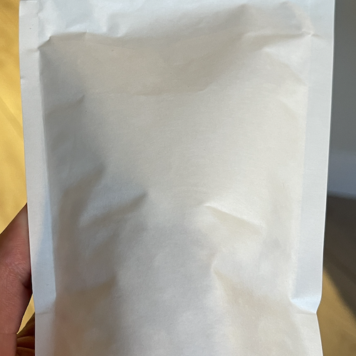
Single Serve Stand Up Pouch Design
We are Neeva. Our first product, Neeva Cereal is a single serve package of protein cereal that can be consumed in a shaker cup like a protein shake, or in a bowl like traditional cereal.
We want to combine the efficiency of a protein shake (people on the go) with the fun memory of eating a bowl of cereal in front of the TV on a Saturday morning. We believe that health and treats can go hand in hand and people shouldn't have to sacrifice in the name of a healthy lifestyle. This package would be a single serve stand up pouch that has cereal and protein mixed together for a customer to throw into a shaker and then consume however they would like (Either out of the shaker, or in a bowl). We like the idea of giving a lawyer permission to let their inner child out every time the rip and pour a bag of Neeva Cereal. We want to cater to both aspects of personality; Fun (loud colours that call back to the cereal they loved as a kid) yet simple (keep text and design to the point so that it screams that this is an easy solution to your busy day)
We gave 50 people samples and the main things that came back were:
- They loved the efficiency of the grab and go healthy cereal
- It made them feel like their health was "fun"
- It felt very nostalgic to the cereal they ate when they were young
- They viewed it as a breakfast alternative but also as a protein shake alternative
Beschreibung der Produktzielgruppe
- Health and Wellness enthusiasts
- People who partake in physical activity 3+ times a week (HIIT Classes, Spin Classes, Running, Power Lifting etc)
- People currently shopping for supplements in a supplement store
- 15-35 years old
- Busy Mom's who don't have the time to make healthy snacks for themselves
- People who want to let out their "inner child" in terms of their snacks
- People within the "gym culture"
- Instagram Fitness Influencers
- This will be sold primarily through e-commerce but also within supplement stores
Kreative Vision
Stileigenschaften
Designanforderungen
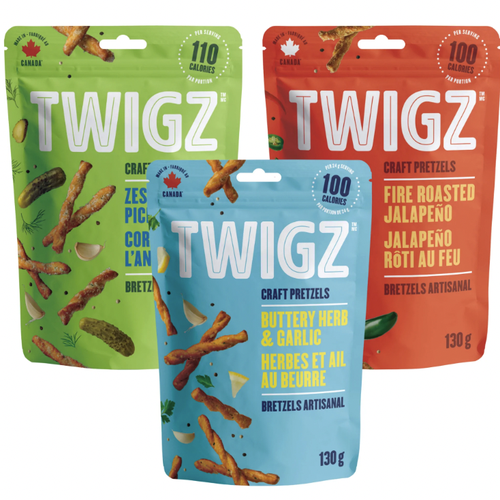
I would like a 4.3 inch by 7.6 inch stand up pouch design for a single serve package (about 60g)
Starting with Frosted Flakes Flavour
- Front should be loud, playful and remind people of the "cereal" isle in grocery stores. Want to make the brand feel nostalgic and give consumers the permission to enjoy the cereal they no longer eat because of all the sugar/additives. Would like claims included. Again looking for the combination of FUN yet SIMPLE. Use of 1-2 colours would be ideal.
- Can include a photoshop image of milk being poured into a bowl of cereal if you would like
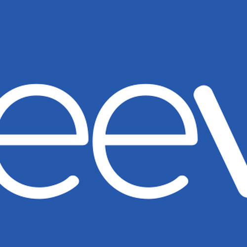
- The Logo will just be the word "Neeva" written in Comforta Google Font
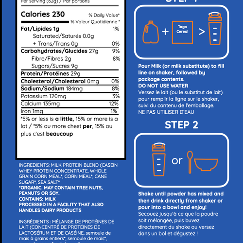
- Back needs to have nutritional information and ingredients but also instructions of how to consume . See attached photo of back
Was vermieden werden soll
I would like to keep the package simple. Let the colour be the loud and playful. Avoid putting "mascots" or people on the design
Maße
Verpackungsmaße
Stand Up Pouch - 4.3 x7.6 x2
Wettbewerb Deliverables
1 x Produktverpackung
Finale Dateien
Wenn Sie Schriften verwenden, die eine Lizenz erfordern, klären Sie zunächst mit dem Kunden, ob er damit einverstanden ist. Aus Lizenzgründen ist es besser dem Kunden die Informationen zur Schriftart mitzuteilen und wie man diese kaufen kann, ohne dabei die eigentlichen Dateien zur Verfügung zu stellen.
Fun, Loud but yet simple.
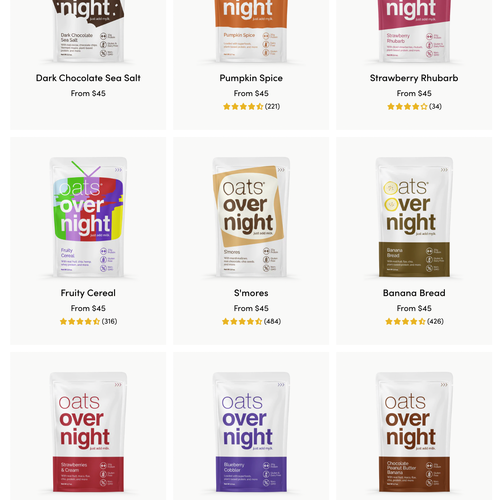
https://www.oatsovernight.com/