Informationen über Ihr Unternehmen
Name der Organisation
VireUp
Beschreibung der Organisation und Ihrer Zielgruppe
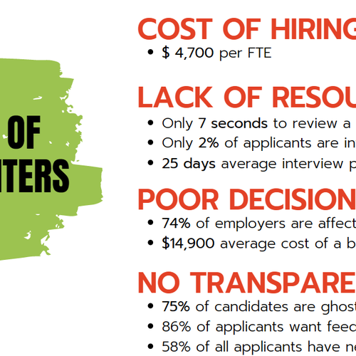
We provide AI-powered online video interview platform for companies. Our AI system scores candidates responses based only on what they say rather than how they look or sound. We rank the candidates so that recruiters can just focus on high ranked talents among hundreds or thousands of them and save a lot of time. Our main target audience is the recruiters (esp. at high level) working at mid- and large-size companies. We target businesses which have high turnover rate, meaning they continuously recruit people.
Branche
Technologie
Bestehende Website
Wie soll Ihr Design aussehen?
Stilideen
- Mostly-white but still like to use our green color with supportive colors. Alternatively, minimal or no green but colors to complement or logo
- Selective drop shadows that are overlaid with semi flat colors
- Product illustration image(s)
- Something that can be applicable to mobile interface
- No scary robot hands or terminator style inhuman pictures please
Inspirationen für Websites
https://www.outseta.com/
- Illustration of the product is good; but we do not prefer animation like theirs
- Major functionality of the service is in big font
https://99designs.com/profiles/bespokedesign/designs/1817604
- Energetic
- Call-to-action is placed next to description of the product at the very to of the page
- This emotion segment hooks the page visitor
- "Using WooSender AI You can" section is well designed
- Layout of the features section is very tidy and easy to read
https://99designs.com/profiles/annauxui/designs/1845605
- illustrations have a specific design for this page. They dont come across as stock photos/illustrations
- Underlining important things with yellow is good
- Alternating illustrations and corresponding text left and right avoids making the page boring
https://99designs.com/profiles/23ises/designs/1615552
- Rounded boxes looks good
- Someone with smiling face shown at first looks cozy
- The numbers at the top are presented very well
- For our case study, showing the numbers like they did on this page can express them better
https://99designs.com/profiles/joyuxdesigner/designs/1927768
- Explains the journey of the customer in “How do we do it”? However illustrations a bit large.
- We also explained our process flow diagram in the main page description
- FAQ section design (+/- buttons) is good
Inhaltliche Details
Beschreibung der Seitentypen
Page 1: Main page
- We think our main page will consist of four major segments in given order: (1) Call to action, (2) Emotion, (3) Logic, (4) Fear
- At the top of the page, there will be a toolbar where our call-to-action button “Book a meeting” will be shown
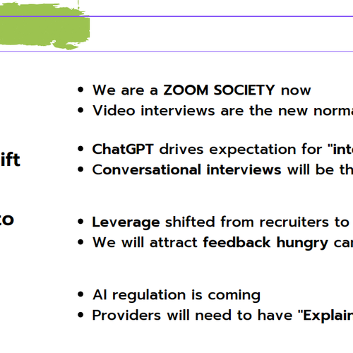
- Emotion segment of the main page is main area below the toolbar where we make the visitor feel the desire to click the call-to-action button. This Emotion segment might include an powerful illustration or photo if it is really impactful. In terms of messaging, it should include a punchy slogan such as “Effortless interviews to identify the best talent”. In order to support this, under this segment, the logos of our list of clients should be shown. As you might imagine, these logos is put to make the visitor trust us. To make them NOT visually popup against the emotion photo above, we believe logos can be shown in gray scale. In addition to that we also like to add logos of news websites that mentioned us. Their presence also help us make the visitor trust us. However, we are not sure where to put them. If we put them below the client logos, it might generate some confusion. Please be creative about how to place these news site logos. On our current website, these are logos are shown under “Talk about Us” title.
- The next segment is the Logic where we explain the logic behind the decision that visitor is expected to make. This segment includes following sub-segments
- features and benefits: See attached document for content
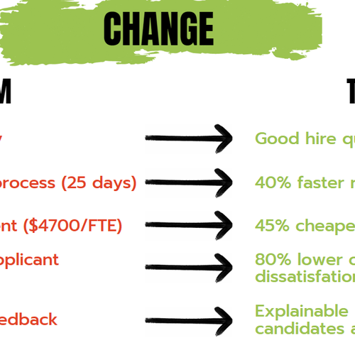
- Our process flow diagram or visual with the following steps (possibly less wordy): 1) Create job interview questions and criteria with the client, 2) Create the interview on VireUp platform, 3) Send the link to candidates, 4) Analyse and score candidate responses sentence by sentence, 5) Create the report and ranked candidate list
- use cases: See attached document for content
- client testimonials : see our current website
- candidate testimonials : see our current website
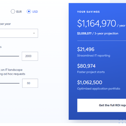
- Savings calculator: Field 1 - Number of questions, 2- Field 2 - Length of questions (seconds) Field 3 - Number of candidates, Field 4 - Your Estimated Savings.
- The final segment is Fear where we inject the fear emotion to the visitor so that he or she is more willing to press our call-to-action button. This segment includes why now. See attached document for content
- Book a meeting form row (maybe a button not necessarily an entire row?)
- FAQ section can be at the very bottom below Fear segment
- See some potential content elements in attached files
Page 2: Main page redesign for mobile
- Can we generate this from actual main page design?
Page 3: Blog
- At the top, you may consider showing the selected or most recent post in full row
- Grid of cards, each card holding a post description (image, title, short description, writer)
- A card may also hold a statistics or quote
Page 4: About Us page
- Grid of profiles
- Mission statement
- Vision statement
Was vermieden werden soll
- We already have our own logo and our current website reflects the green color (#8dc63f) of that logo. However, it looks a bit pale and dominates the view.
- Our current website has a slideshow at the top of the home page. However, it takes time to show our message. Hence we dont want a slideshow at the main page
- No popups
- No animations
- Not too much text
- Even as a placeholder, please avoid using frequently used stock photos
Sonstiges
Weitere Anmerkungen
We will prioritize designs in Figma
Stockmaterial
Der Kunde erlaubt die Verwendung von Stockmaterial für diesen Wettbewerb.
Stockbilder sind lizenzierte Fotos und Vektor-Dateien. Bitte kennzeichnen Sie Stockmaterial, wenn Sie Designs einreichen, damit Kunden für Lizenzen bezahlen können.
Wettbewerb Deliverables
4 x Webseiten Design(s)
Finale Dateien
Wenn Sie Schriften verwenden, die eine Lizenz erfordern, klären Sie zunächst mit dem Kunden, ob er damit einverstanden ist. Aus Lizenzgründen ist es besser dem Kunden die Informationen zur Schriftart mitzuteilen und wie man diese kaufen kann, ohne dabei die eigentlichen Dateien zur Verfügung zu stellen.